Flourish helps journalists create easy data visualizations
Data visualization brings more eyes, attention and understanding to complex stories. When it works well, it can make a story crystal-clear. But it takes effort, coding and time—and is sometimes out of reach for all but the biggest newsrooms.
One easy way to make data visualizations is through Flourish, a tool that helps you design and create graphics to embed on a website or export as a SVG file. We’re making Flourish free for journalists, so that it’ll be easier for newsrooms of all sizes and budgets to create their own data visualizations.

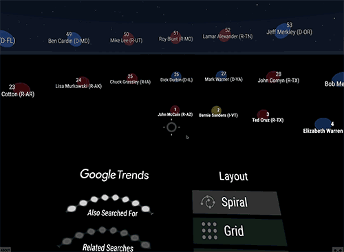
We’re also working with design studio Pitch Interactive to make free virtual reality templates for newsrooms in Flourish. Here’s an example: The visual above shows related Google searches for TV shows. Any journalist in a newsroom could use that template, but with different data. For example, the visual below shows searches for U.S. Senators before this year’s midterm elections. (And here’s the visual code on GitHub).
Traditionally, creating the same visual with different data is a tricky job involving developers. Flourish makes that easy—visuals can just be reused as they are, or you can create “stories” to narrate the visual by adding captions and leading the user on a visual journey.
With Flourish, journalists with no coding experience can make high-end interactive graphics and stories with no tech support—check out these tutorial videos for extra help. Crucially for the data journalism community, Flourish lets newsrooms share templates with each other. Though newsrooms can create some private templates, they can open-source others.
Flourish was soft-launched last year, and since then, the development team worked with designers and data journalists to build the launch version that has just been released. In that time, hundreds of journalists and newsrooms have signed up to use Flourish.
Flourish is just one of a series of tools and resources in our News Lab data journalism toolkit. Other tools include Tilegrams, Data Gif Maker and the Data Journalism Handbook. Look for more this year as we work to make it easier for data journalists to investigate, process, visualize and surface their data across the news industry.