Introducing Data Studio Community Visualizations as Chart Interaction Filters

Community Visualizations as Chart Filters
At the beginning of 2019, we introduced richer interactivity in Data Studio, enabling charts to act as filters, facilitating more interactive data explorations and faster time to insight. If you’ve been following the community visualizations developer preview, you may have noticed that community visualizations haven’t yet supported chart interaction filters.
Now, we’ve added the capability for developers to add filter interaction functionality to community visualizations. When interacting with a community visualization that supports filter interactions, your interactions with the community visualization can filter the rest of your dashboard.
For example: below is a community visualization heatmap that acts as a chart interaction filter.
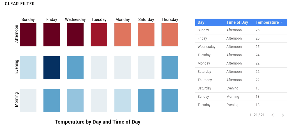
Temperature heatmap community visualization. Each cell is selectable and can filter the table underneath. See the report live.
Community visualizations acting as chart filters make even more custom, interactive charts possible in your reports. You can create calendar heatmaps where you can click-and-drag to select a date range, or a timeseries chart where you filter dragging a rolling window along your chart. You could even create a dendrogram of organizational chart data, and select different nodes to filter the dashboard by the individuals represented at each node.
Report editors can enable filter interactions for each visualization, and use them to filter other components on the dashboard, just like the Data Studio built-in charts.
We’re continuing to add features to make community visualizations more powerful and easier to use. Learn how to add filter interactions to your community visualization by reviewing our developer documentation, and sign up to keep up with the latest in Data Studio developer features.