A new global COVID-19 map for journalists
As reporters continue to try to make sense of the coronavirus pandemic and its effects around the world, visualizing data can help make reporting clearer for readers. Until today, finding statistically valid maps that can display the status wherever you are in the world has been difficult to do.
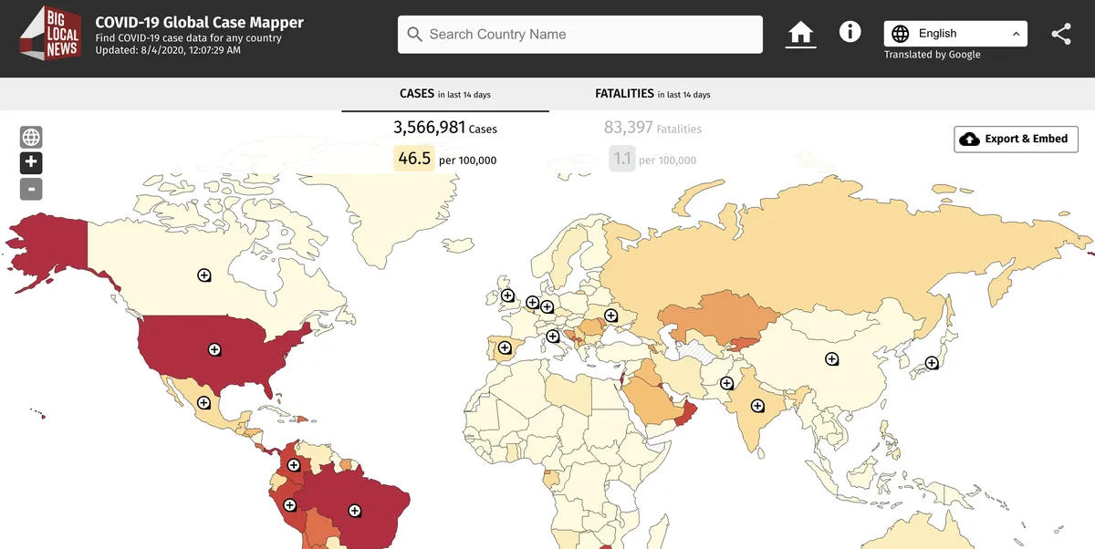
Today, Stanford University’s Big Local News and Pitch Interactive—with support from the Google News Initiative— have launched the COVID-19 Global Case Mapper, which makes it possible for journalists anywhere in the world to embed up-to-date visualizations of the pandemic on their sites for readers.
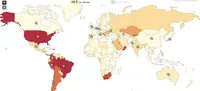
Screenshot of the new global map
Earlier this year the team launched a U.S. version of the map. This new version expands that embeddable view across the globe through data for 176 countries in addition to the United States, plus additional state and regional data for 18 countries. The team has used Google Translate so the experience can be viewed in more than 80 languages.
The data is from the New York Times’ open COVID-19 county dataset and the COVID-19 Data Repository by the Center for Systems Science and Engineering (CSSE) at Johns Hopkins University and is updated daily.
This is part of a partnership to launch a global data resource for reporters working on stories about COVID-19. In partnership with the Google News Initiative, the JSK Journalism Fellowships at Stanford University and the Big Local News group will aggregate data from around the world and help journalists tell data-driven stories that showcase local information.
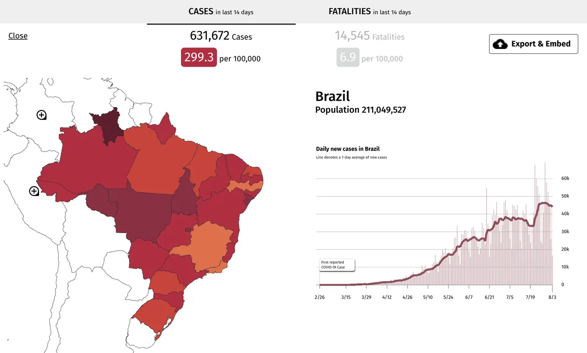
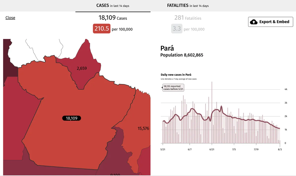
Unlike other coronavirus case maps, the Case Mapper project allows local reporters to embed a map of their area or even a national case map. The map shows cases in relation to population. It’s colored by numbers of cases per 100,000 people over the past 14 days and shows you the severity of outbreak by the number of people in each location, making it easier to compare where you live to the world as a whole.
Since its launch in April, the map has been embedded on thousands of news sites across the United States, such as Type Investigations, a nonprofit organization supporting investigative journalism, and Bay City News, a local news service for journalism organizations across the San Francisco Bay Area which maintains a COVID-19 Information Hub.
More in-depth, country-level data will be added over time as the map is developed further and as journalists around the world use it to explain how the pandemic has spread. Even a global pandemic can seem abstract until you can see how it has spread. These maps help reporters anywhere to do just that.


