Google Maps gets a new look
The world is an ever-evolving place. And as it changes, Google Maps changes with it. As roads close, businesses open, or local events happen in your neighborhood, you’ll see it on Google Maps. When you schedule an event using Google Calendar, get a reservation confirmation in Gmail, or add a restaurant to your “Want to Go” list, Google Maps reflects that too. Now, we’re updating Google Maps with a new look that better reflects your world, right now.
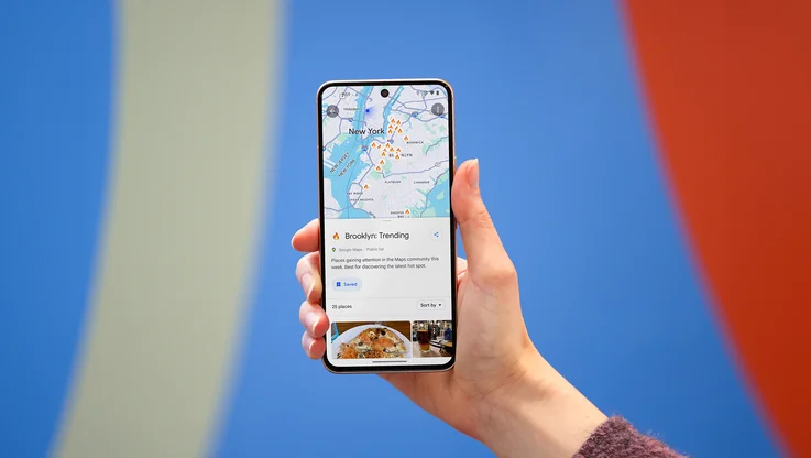
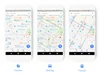
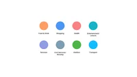
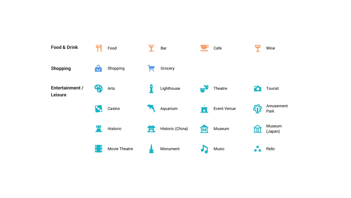
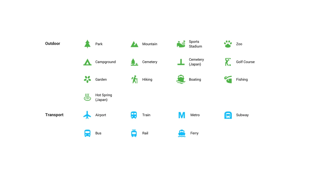
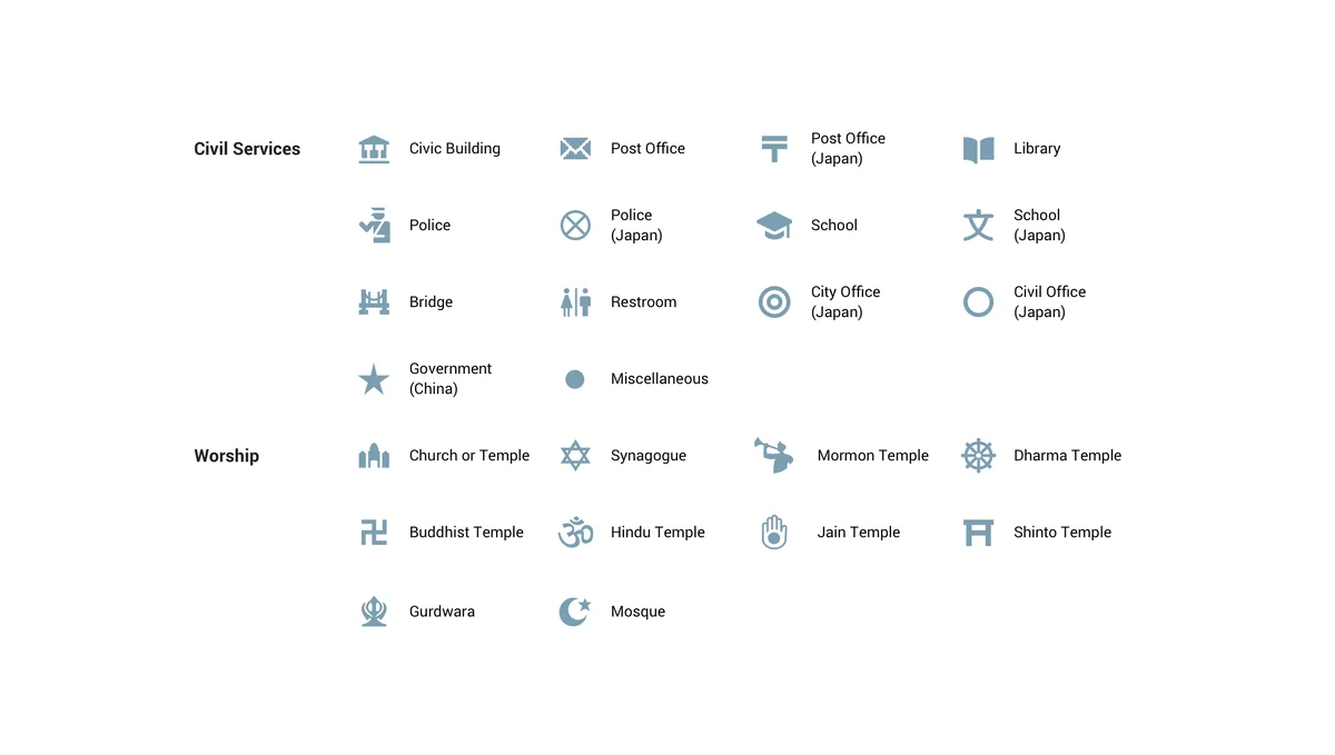
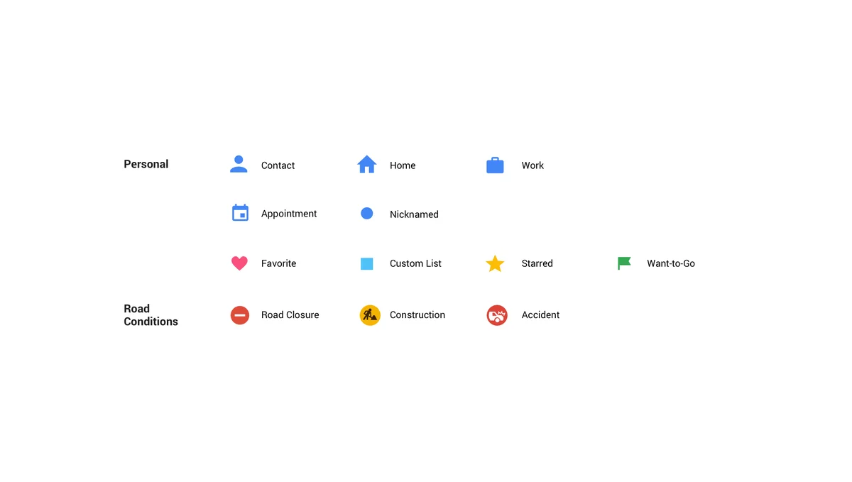
First, we’ve updated the driving, navigation, transit and explore maps to better highlight the information most relevant to each experience (think gas stations for navigation, train stations for transit, and so on). We’ve also updated our color scheme and added new icons to help you quickly identify exactly what kind of point of interest you’re looking at. Places like a cafe, church, museum or hospital will have a designated color and icon, so that it’s easy to find that type of destination on the map. For example, if you’re in a new neighborhood and searching for a coffee shop, you could open the map to find the nearest orange icon (which is the color for Food & Drink spots).
We’ve created a cheat sheet of the new colors and icons to help you get acquainted with the new look:

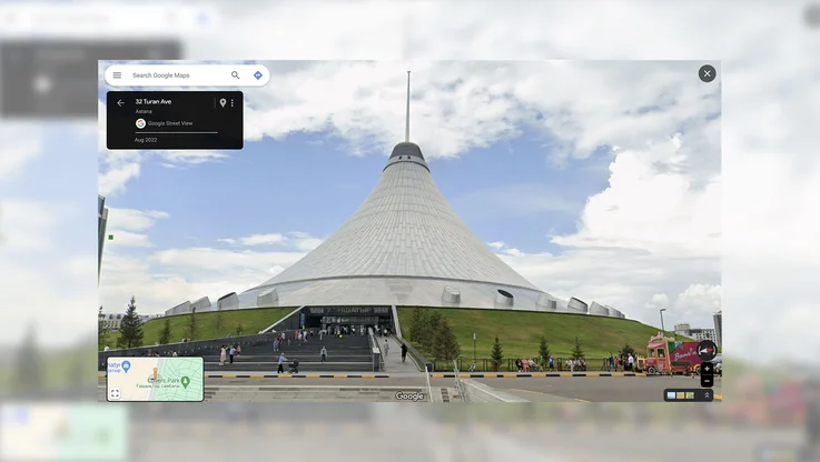
You’ll see these changes over the next few weeks in all Google products that incorporate Google Maps, including the Assistant, Search, Earth, and Android Auto. Over time, the new style will also appear in the apps, websites and experiences offered by companies that use Google Maps APIs as well.

So no matter how or where you’re using Google Maps, you’ll have the same consistent experience.